Thursday, June 7, 2012

Shadow Shot

6.8.2012
In this photo, you see a girl in front of a white background looking at her shadow. However, her shadow is turned away from her.
The picture was taken intentionally in focus in order to view the picture clearly and understand what is happening.
I had to photoshop the shadow into the picture because it's physically impossible for one's shadow to be turned away from them. Since she originally had another shadow behind her, I photoshopped it out.
The picture was taken indoors with a white background so the focus of the picture could be seen. Also because it was easier to produce a shadow instead of going outside and having the sun shine at the wrong angle. I manipulated the warm light. Sometimes we do things that disappoint others, but ultimately disappoint ourselves. I reflected that disappointment through a shadow. The way she is looking at herself represents how she realizes the disappointment and is sorry for it.
Overall, I think I did pretty good on this shot because it came out very nice and the shadow came out very precise and shaped better than I expected. I chose to do this photo in order to emphasize the concept of disappointment.  It wasn't even difficult to do this shot. I only took a few pictures and was satified with what I received.

Contest Photo

6.7.2012
In this photo you see sea shells implanted in sand. In the background is the ocean and the sky.
The seashells on the sand were intentionally taken in focus in order and the background blurred in order to draw attention to the shells and not to the ocean (although both are important components in the shot).
To really make the picture stand out more, I deepened the brightness and contrast. I messed with the color levels and threw in more green to match what it really looks like in person. I also sharpened the picture a bit.
The picture was taken outdoors at La Jolla shores during the daytime when it was a partially cloudy with some sunlight peeking through. The lighting is pretty neutral due to the nature of the weather, time, and temperature in conjunction with one another. I wanted to do a beach themed photo because I really like the beach and I think it looks beautiful. The picture contains very nice quality, so I thought it would fitting and appealing for a contest.
Overall, I think the picture was successful because it came out really nice and looks pretty cool. I didn't have to take many shots of it and my angle was pretty smooth.

Sound Series

In this series of photographs, there are two guys on a swing set just swinging. They are at the playground at Penn Recreation Center. My sound was a metronome ticking like a clock at a Largo/Larghetto setting of 60.
The pictures were intentionally taken in focus to capture what was going on.
I brightened the picture to make it stand out and to give it a happy and playful mood because they are at a playground swinging like children. I whipped the photos together through a video program called Movavi and basically just matched the seconds of the sound with each photo to get it exactly on the beat.
These set of photos were photographed outside in the sun at a nice little playground when there were not people there. The lighting is pretty bright to give it the happy tone and to highlight their happiness when they're swinging.
Overall I think I did pretty well. Honestly I could have taken better shots, but I think my angle was good. At first, I wanted to record a clock ticking as my sound, but then it was hard to record that sound on my phone because it was very faint even if I put it up close to my phone. I wanted to do a clock sound with these set of pictures to symbolize how fast time goes by when you're having fun and that you're never too old to do childish things. But the metronome sounds similar to a clock and has the same beat. It represented how everything in life has a beat and we're the instruments.

Wednesday, April 11, 2012

3 Strangers

4.10.2012
 Lamar
3
Fun Fact: He loves to play on the playground (:

4.10.2012
 Rashay
7
Fun Fact: She likes to eat and wants to be a chef when she's older c:
4.10.2012
Dejah
9
Fun Fact: She likes to do flips and wants to be a gymnast when she's older [:

Tuesday, March 20, 2012

Symbolism

4.10.2012
This is a portrait of a girl who looks like a ghost. It is suppose to symbolize one's soul. It is pretty up close to the camera. 
This photo was intentionally taken to look like it was blurred in order for it to portray the "soul." It is out of focus but still in focus to the extent of her figure and features. 
I did not photoshop the picture to make it ghost-like. All I did was set the ISO to about 400 and then I moved the camera around until I heard the shutters click, signifying that it took the picture. This was the result of it, and I liked it. I did adjust the brightness so it looked darker and the contrast to make her pop out more. I also manipulated the color scheme to make the picture look a bit aged. 
The picture was taken indoors against the white wall of my house. The lighting was a bit bright when I took the picture, but I darkened it. 
Overall the picture was a success because it came out just how I expected it to. Also, this was my first shot and it came out pretty perfect. 

Wednesday, February 29, 2012

Radiohead Tim


2.29.2012

This is a photo of Tim with an old radio as his head. The radio is up close while he is semi close to the camera.
The radio and body were taken intentionally in focus in order to make it seem like the radio was realistically his head. The background is out of focus to highlight the subject. I had a friend hold the radio close to the camera while Tim was a bit farther back from the camera. I cropped the picture a bit so you cannot see the object holder's hand and arm. I also darkened the image and manipulated the color balance so that there is more green and yellow in the picture. I also sharpened the image so the person stuck out more.
The picture was taken outdoors in the back of the school away from buildings and other distractions. The lighting is pretty neutral to give it a more natural look.
Overall, the picture was a success because I was able to take the shot in about a minute and got my final shot after two or three times shooting. It came out pretty nice and natural as I had imagined it to be.

Monday, February 20, 2012

Perspective of a Fennec Fox

2.15.2012
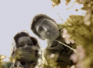
This is a photo from a fennec fox's point of view. This animal has dichromatic vision, similar to a dog's vision, meaning they can't tell the difference between green, yellow, and red. Their color scheme is a composition of faded yellowish green, white, blue, purple, and gray. In this photo there is a girl and guy looking down at the fox that is in a field of flowers. The flowers are up close and the people are kind of close. 
The people in the picture were intentionally taken in focus and the flowers out of focus of emphasize how the fennec fox is looking at the people rather than the flowers. Since this animals has dichromatic vision, the green, yellow, and red in this picture were all changed to one mutual color between the three. It is a yellowish, red, green color. Then purple flowers were faded to pink, and the blue sky was changed to a more faded purplish blue. The people were changed to a almost black and white hue. 
This photo was taken outside in a flower bush from a low point of view in order to showcase the fennec fox's size. The image is light and the colors are a bit faded to fit the vision of the fox. 
This photo was pretty successful because the angle was precise and everything just fit perfectly together.

Aberrance

2.15.2012
This is a photo of Breyane producing fire from her hands. She is wearing black and is against a white background to highlight the main point of the aberrance photo. The subject is pretty close.
To portray this aberrance concept, I cut fire, from a picture of when I went to a bonfire at the beach and positioned them in their hands. I also edited her eyes to reflect the elements in her hand. I also warmed up the picture by darkening it a bit and reddening the picture with a slight touch of green. The image was intentionally taken in focus to bring light to the entire subjects. 
The image is pretty light with a lot of contrast to make the picture appear striking and full of life. It was taken outdoors against a white brick background to keep the subject and photo simple. This is trying to portray aberrance and how humans can't produce or hold fire. 
In my mind, this picture was successful because I was able to pull off the concept of someone producing fire when in reality, they can't. 

Monday, January 16, 2012

Commercial Shot

1.16.2012
In this picture, there is a woman wearing black Ray Ban sunglasses. The fan is blowing her hair to the left while she looks to the right. She is wearing a black v neck shirt and is placed in front of a gray background.
It was taken intentionally in focus and up close because it is a head shot focusing on the sunglasses than anything else. I darkened the picture to give it a "cool" and laid back tone and to portray how the Ray Bans sunglasses make you look cool. To emphasize the coolness, I manipulated an electric fan to blow directly in front of her face. I changed the colors of the photo to black and white with a tone of gray to also give off a chill tone and feel. I placed her in front of a gray background to give the photo a simple look and to not distract the viewer from the whole point of the photo, which are the Ray Bans.
In this photo, I attempted to portray the simplicity and cool vibe that Ray Bans give you when you wear them. The photo was taken indoors against a wall. It is semi dark to illustrate the laid back tone.
I believe my photo was a success because it came out how I imagined it to come out.

Thursday, January 12, 2012

6 Different Lightings

January 6, 2012

January 6, 2012
January 6, 2012


January 6, 2012
January 6, 2012
January 6, 2012
These photos are of a ballerina with a white top, black spandex shorts, pink tights, and pink pointe shoes. She is sitting on a velvet red couch and is placed in front of a black background to portray a room. The subject is not far away, but is not up close and has different types of light shining on her.
All the images were taken intentionally in focus to capture every aspect of detail in the picture. The lighting in the first picture was taken with the strobe light for the lighting to illuminate the entire subject and setting. The second picture was taken with one hot light pointed at the subject from a slight diagonal in order to imitate a spotlight on the subject as a dancer would be on stage with a spotlight. The tone of the picture is intense. The third picture was taken with two hot lights pointed from the right diagonal front and left diagonal front to give off a bright scene. The fourth picture was taken with one hot light pointing at the subject from the bottom right diagonal to light up the bottom part of the subject and attract attention to her important dancer features such as her tights and pointe shoes. The fifth picture was taken with outdoor light coming from the left to make the picture look natural. The sixth picture was taken with a high hot light pointing down at the subject from the left side to make the left side of the picture dark in order to portray an ominous side to ballet.
In these photos, I intended to portray the different trials or perspectives of a ballerina. The first picture is the common perception of how ballet and dancers are seen. However, there's more to dancers than meets the ey. The second picture showcases the dancer as if they were on stage, with a spotlight, correct posture, and character. The third picture portrays how most dancers see themselves. The shaded sides around the dancer explain how there will always be room for improvement and exploration for new moves. But the bright part of the picture represents the passion of the dancer as an artist. The fourth picture brings light to the tights and pointe shoes to display how important the features of a dancer are and that they help create the artist. Since the fifth picture was taken with natural light, it implies that dancing is a natural art for humanity and that it is made up from natural aspects such as muscles, flexibility, style, and passion. In the sixth picture, the top part of the subject is partially dark, while the bottom part of the subject is brightened, and the left side of the picture is dark while the right side is bright. This portrays how the audience only sees the dancing of the dancer and their result from practicing, but don't see or know the practice, hard work, time, effort, criticism, lectures, stamina, sweat, blood, and tears that make the dancer, a dancer. All the pictures were taken indoors.
I believe my work was very successful because it came out exactly as I envisioned it to be. I went into the project not knowing how I would want the lighting to appear, but as I was doing this photo shoot, I began to realize how I wanted them to turn out, and they turned out very nice.