Wednesday, February 29, 2012

Radiohead Tim


2.29.2012

This is a photo of Tim with an old radio as his head. The radio is up close while he is semi close to the camera.
The radio and body were taken intentionally in focus in order to make it seem like the radio was realistically his head. The background is out of focus to highlight the subject. I had a friend hold the radio close to the camera while Tim was a bit farther back from the camera. I cropped the picture a bit so you cannot see the object holder's hand and arm. I also darkened the image and manipulated the color balance so that there is more green and yellow in the picture. I also sharpened the image so the person stuck out more.
The picture was taken outdoors in the back of the school away from buildings and other distractions. The lighting is pretty neutral to give it a more natural look.
Overall, the picture was a success because I was able to take the shot in about a minute and got my final shot after two or three times shooting. It came out pretty nice and natural as I had imagined it to be.
Monday, February 20, 2012

Perspective of a Fennec Fox

2.15.2012
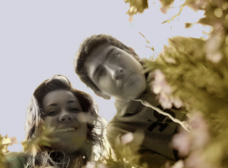
This is a photo from a fennec fox's point of view. This animal has dichromatic vision, similar to a dog's vision, meaning they can't tell the difference between green, yellow, and red. Their color scheme is a composition of faded yellowish green, white, blue, purple, and gray. In this photo there is a girl and guy looking down at the fox that is in a field of flowers. The flowers are up close and the people are kind of close. 
The people in the picture were intentionally taken in focus and the flowers out of focus of emphasize how the fennec fox is looking at the people rather than the flowers. Since this animals has dichromatic vision, the green, yellow, and red in this picture were all changed to one mutual color between the three. It is a yellowish, red, green color. Then purple flowers were faded to pink, and the blue sky was changed to a more faded purplish blue. The people were changed to a almost black and white hue. 
This photo was taken outside in a flower bush from a low point of view in order to showcase the fennec fox's size. The image is light and the colors are a bit faded to fit the vision of the fox. 
This photo was pretty successful because the angle was precise and everything just fit perfectly together.

Aberrance

2.15.2012
This is a photo of Breyane producing fire from her hands. She is wearing black and is against a white background to highlight the main point of the aberrance photo. The subject is pretty close.
To portray this aberrance concept, I cut fire, from a picture of when I went to a bonfire at the beach and positioned them in their hands. I also edited her eyes to reflect the elements in her hand. I also warmed up the picture by darkening it a bit and reddening the picture with a slight touch of green. The image was intentionally taken in focus to bring light to the entire subjects. 
The image is pretty light with a lot of contrast to make the picture appear striking and full of life. It was taken outdoors against a white brick background to keep the subject and photo simple. This is trying to portray aberrance and how humans can't produce or hold fire. 
In my mind, this picture was successful because I was able to pull off the concept of someone producing fire when in reality, they can't.